Source: http://www.sqljason.com/2010/06/display-total-on-top-of-stacked-chart_8589.html
It is a normal phenomenon that human beings take most of the simple things for granted. Take this case, one of my blog readers sent me a mail asking how to display the total on top of a stacked chart in SSRS. The first time I read it, I was almost going to blurt – just enable some property to display subtotals. But the more I thought about it, the more elusive the property became and that is when I realized there is no such property. So for the benefit of all, I thought about posting the workaround that I devised for this.
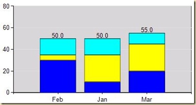
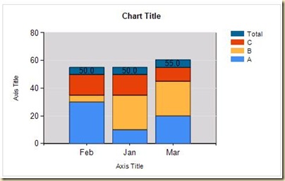
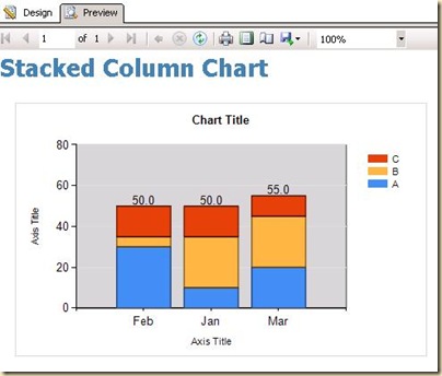
Suppose I have a simple stacked column chart with Month on Categories, Product Category on Series and Sales as the measure. The requirement is to display the total of all Product Categories for a month on top of the stacked column chart. The required output is shown in the below image.
For this, follow the steps below:-
1) The original query was
SELECT Month,
Category,
Sales
FROM Sales
Modify it as follows
SELECT Month,
Category,
Sales
FROM Sales
UNION
SELECT Month,
‘Total’ AS Category,
0.1 * SUM(Sales) AS Sales
FROM Sales
GROUP BY Month;
This is done to include an extra row called Total for Product Categories. The value for Sales for this row would be 10% of the total Sales of that month.
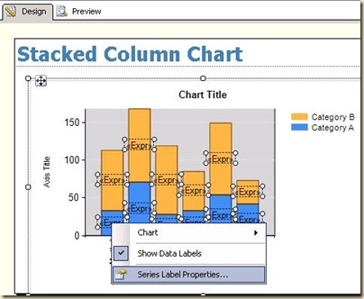
2) Go to the Design tab, right click on the chart and enable the Show Data Labels option. Then select the series label properties by right clicking on the data labels.
3) Edit the Label data and enter the following expression
=iif(Fields!Category.Value=”Total”,sum(Fields!Sales.Value,”Chart1_CategoryGroup”)-sum(Fields!Sales.Value),””)
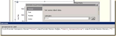
The above expression displays blank if the Product Category is not “Total” and displays the sum of the entire Product Categories for that month (including the value for Total) – sum of the Total field.
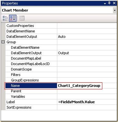
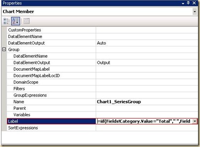
P.S. : “Chart1_CategoryGroup” would have to be replaced with the category group name of your stacked column chart. To find this, click on the Month (category) button in the chart and press F4. You will find the Name of the group in the property panel that opens up as shown below.
4) Now we should be getting the following output when we click on the Preview tab.
Go back to the Design tab and click on Product Category (series) in the chart and press F4 to open the property panel. Enter the below expression in the Label property
=iif(Fields!Category.Value=”Total”,” “,Fields!Category.Value)
This is done so that the Total value will not appear in the legend.
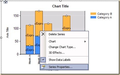
5) Right click on the stacked columns and select series properties.
6) Go to the Fill tab and enter the following expression for the color
=iif(Fields!Category.Value=”Total”,”Transparent”,”Automatic”)
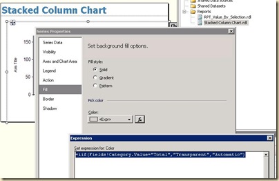
This is done so that the Total value will be transparent and hence, would look like it is not present.
7) Preview the report and you should be getting the required output
This report has been done with SSRS 2008 R2 but the concept should work in SSRS 2008 more or less the same way.
Update
For SSRS 2008 users, it has been noticed that all the bars become black when the above fill expression is used. That is because the Automatic colour can not be used in expressions. So as a workaround, follow the step below instead of the 6th step above
1) In BIDS, press Alt+R to open the Report Tab and select Report Properties. Then go to the code section and paste the following code
Private colorPalette As String() = {“Green”, “Blue”, “Red”, “Orange”, “Aqua”, “Teal”, “Gold”, “RoyalBlue”, “#A59D93”, “#B8341B”, “#352F26”, “#F1E7D6”, “#E16C56”, “#CFBA9B”}
Private count As Integer = 0
Private mapping As New System.Collections.Hashtable()
Public Function GetColor(ByVal groupingValue As String) As String
If mapping.ContainsKey(groupingValue) Then
Return mapping(groupingValue)
End If
Dim c As String = colorPalette(count Mod colorPalette.Length)
count = count + 1
mapping.Add(groupingValue, c)
Return c
End Function
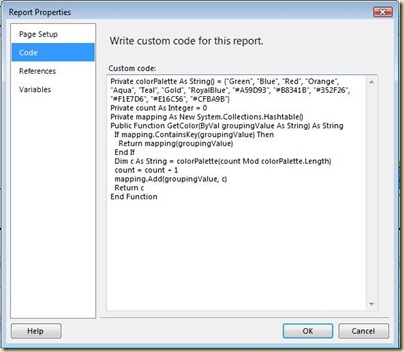
Right now, there are only 14 colours in the palette but more colours can be added if you have more than 14 values in the series.
2) Use the following expression for colour in the fill tab of series properties.
=iif(Fields!Category.Value=”Total”, “Transparent”,Code.GetColor(Fields!Category.Value))
This would do the trick.